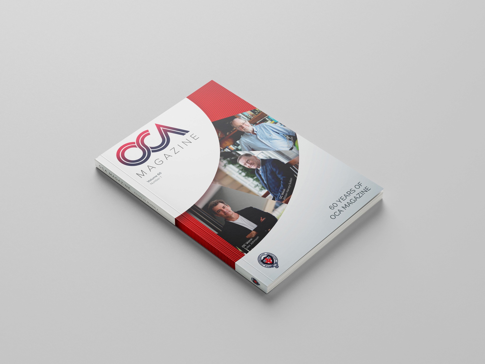
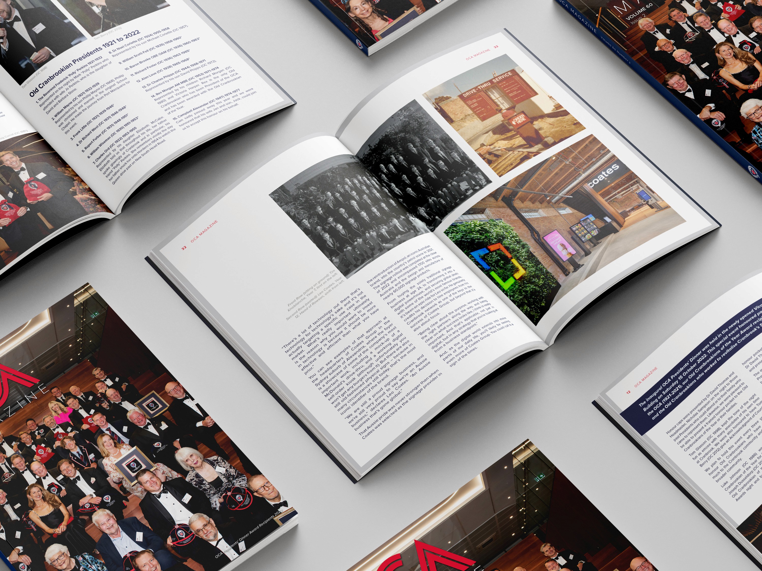
Cranbrook School is a prestigious educational institution that required ongoing editorial and publication design for their Old Cranbrookians’ Association (OCA) biannual magazine.
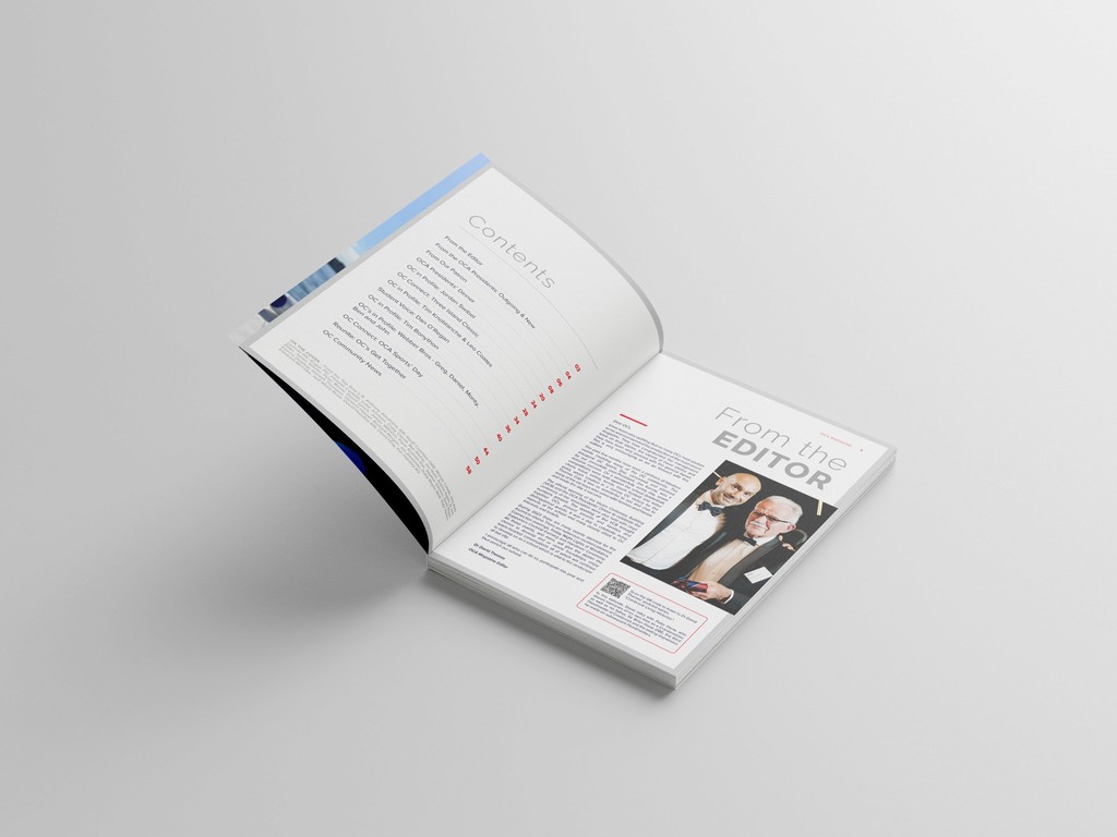
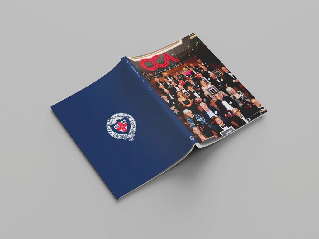
The school needed a design refresh for their 60+ page OCA magazine, aiming to enhance readability and engagement while maintaining brand consistency. My role involved designing and formatting the magazine over several years, ensuring it was visually appealing, easy to navigate, and aligned with the school’s established brand identity.
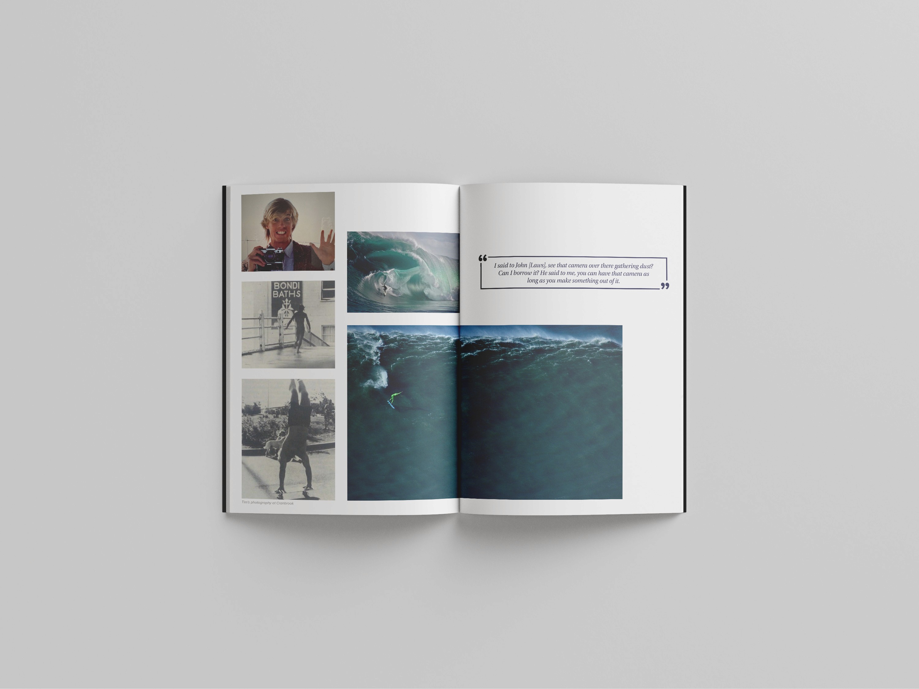
I began by refining the layout, incorporating sophisticated typography choices and improved visual hierarchy to enhance the reader experience. Over multiple editions, I consistently delivered clean, engaging designs that showcased the content while staying true to the traditional style valued by Cranbrook School. The design process was streamlined by using adaptable templates, ensuring consistency and efficiency across all editions.
Over the course of this collaboration, I delivered four editions of the magazine, which received positive feedback from both alumni and staff. The refreshed layouts and improved formatting have strengthened the publication’s appeal while making the content more engaging for readers.
The ongoing success of this project has ensured that Cranbrook School’s magazine remains polished and professional, reflecting the quality and heritage of the institution.
